Lunaire
Client
- Student Project
Role
- Branding & Identity Design
- Logo Design
- Packaging Design
- Web Design
The Challenge
How can I create a brand that lives in the not so distant future and utilizes theoretical technology? I wanted to brand an everyday item in a way I had not seen before.
The Solution
If “Space Is The Place” by Sun Ra and “Water Get No Enemy” by Fela Kuti had a baby in the year 2030. It would be this project. Not based on the styles of music, but what the song titles speak to conceptually. I was able to create a brand that feels like it belongs in the future.
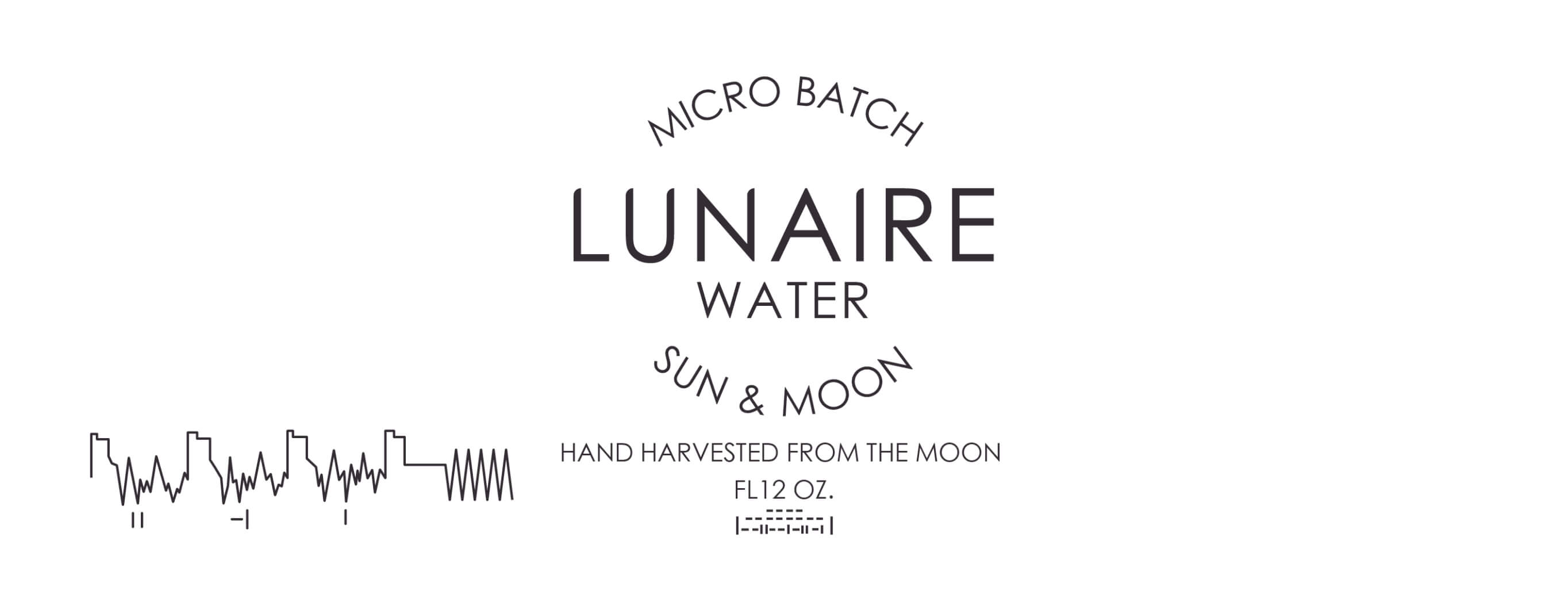
layout for the laser etched engraved bottle
Single page website layout

DESIGN
The brand identity utilizes elements of minimalism and clean aesthetics. Its primary colors are black and white with clean, sharp lines.
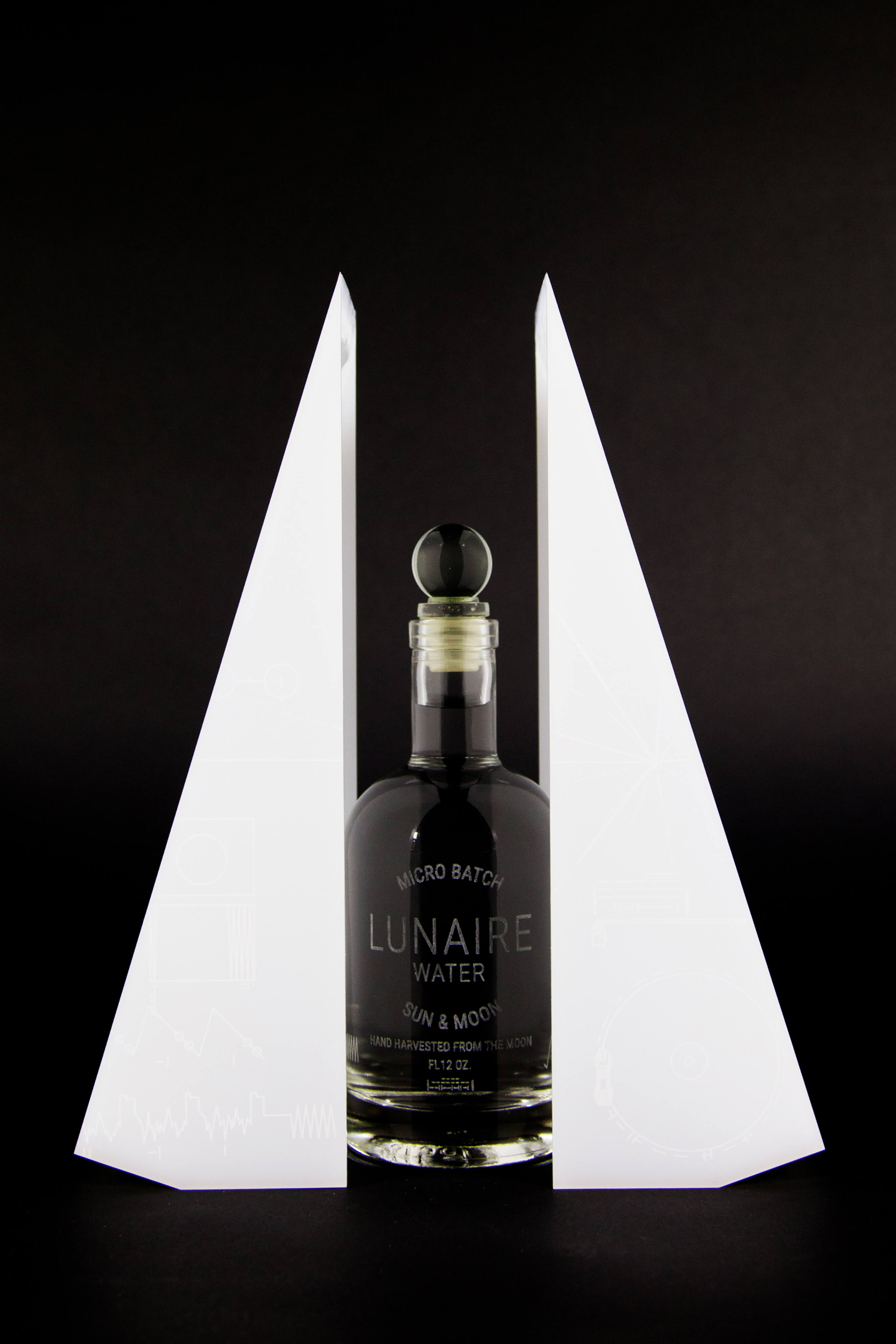
The elements that make up the project consist of a landing page describing how the water is harvested, a glass bottle and its container. I had a specific aesthetic I wanted to adhere to in the design process.
Color



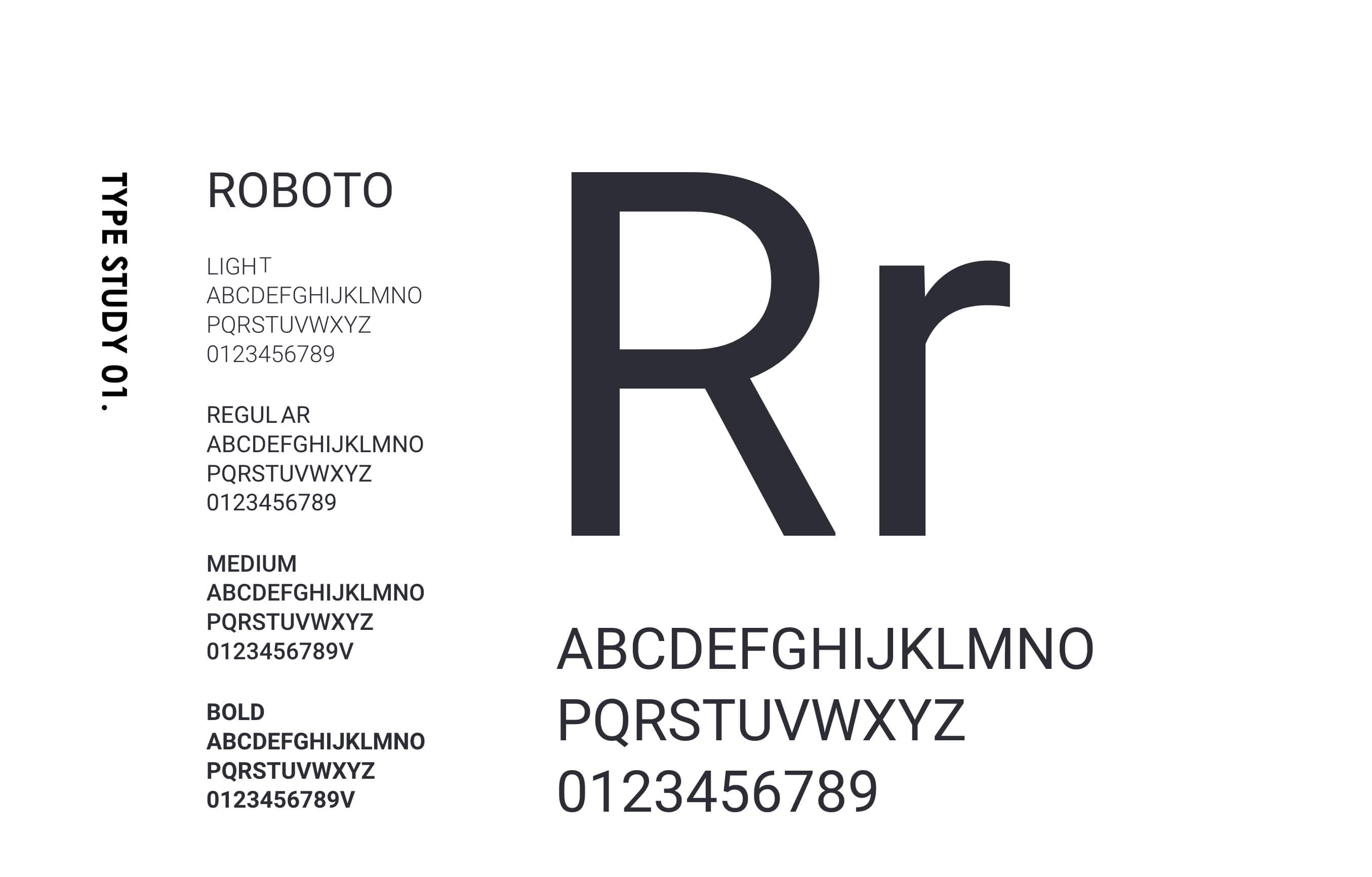
Space Graphics
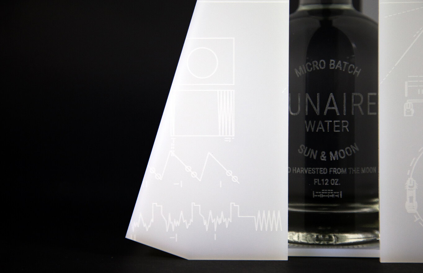
The graphical influence of the package design comes directly from Voyager 1. It houses a key to playing the record inside. The diagram appears on both the inner and outer surfaces of the cover. This is a spoke to the brand due to the future thinking of the designer and engineers who put Voyager 1 into space.
“Flying aboard Voyagers 1 and 2 are identical “golden” records, carrying the story of Earth far into deep space. The 12-inch gold-plated copper discs contain greetings in 60 languages, samples of music from different cultures and eras, and natural and man-made sounds from Earth. They also contain information that an advanced technological civilization could convert into diagrams and photographs.”
